From Checkboxes to Conversations
From Checkboxes to Conversations
Ali Khan Design · Self-Initiated · Q1–Q2 2026
I didn't set out to audit Squarespace's AI. I set out to redesign my portfolio. What I found instead became this case study — a documented audit of Blueprint AI across two user journeys, twenty distinct failure modes, and a redesign grounded in the principles I use every time I work with AI as a design tool.
20
Failure modes documented
22
Intents audited
3
Redesigned moments
4
Design principles
My Role
UX Researcher, Interaction Designer
Methods
Comparative audit, failure mode taxonomy, interaction design
Tools
Claude, Figma, Next.js, Vercel
Status
Shipped audit; findings feeding into AI Interface Pattern Library
The Context
A product built around its own inventory, not its users
After being laid off, I needed to rebuild my portfolio. I'd been on Squarespace for years and figured their AI tools would make the refresh faster. I already had the site. I just needed it to sound like me.
What I found was a system that had AI features without AI thinking — tools that generated content confidently without understanding what the content was for, or who it was for. I documented everything.
The audit ran across two tracks. Track B tested the AI writing tools on my existing site across twelve specific prompts. Track A went through the full Blueprint AI onboarding as a new user. Together they produced twenty distinct failure modes and a clear picture of why Squarespace's AI underdelivers on its core promise.
The Problem
The promise: customized for your brand. The reality: a template.
Squarespace's Blueprint AI entry point promises a website "customized for your brand or business after a few simple questions." The onboarding asks six questions. Five are categorical selection — pick a topic from a dropdown, check boxes for goals, choose a personality archetype, select a color palette, pick a font pairing. One asks for something personal: your site title.
The AI generated a complete website from those inputs. The hero headline was "Strategic Interface Design." The About page said "The studio delivers user interface and user experience design solutions." When I tried to add a Portfolio page — the one page my stated goal required — the templates were populated with floristry photography and projects called The Atlas Project and The Lumen Project.
This feels like I just chose a template.
The AI generated a complete website from five categorical selections. None of the output reflected anything personal.
In Track B, the failures were more specific. The AI called me Alexandre. It generated six hundred words of automated chemical synthesis documentation when I described my AI research pipeline. After twelve prompts establishing my professional context, it produced a therapy intake profile recommending worry management techniques and a 7-day behavioral experiment.
My name is Ali, not Alexandre.
After twelve prompts establishing my identity and professional context, the AI generated a bio for a stranger with fabricated credentials.
The Research
Twenty failure modes across two user journeys
I documented every failure systematically. Twenty distinct failure modes emerged across four categories — click any category to explore, and any failure mode to see its definition.
Structural failures baked into how the system was designed — not fixable through better prompting.
20 failure modes · 22 documented intents · Track A (10 steps) + Track B (12 intents)
The most consistent failure — appearing in eleven of twelve Track B intents and structuring the entire Track A experience — was Session Blindness. The AI has no persistent model of the user. Every interaction is the first interaction. Asked to summarize what it knew about me after twelve prompts, it produced a profile for a stranger.
Track A — New user journey
I went through the full Blueprint AI onboarding as myself — a designer who knew exactly what he needed. The system asked me six questions. One was personal (site title). The rest were categorical: topic dropdown, goal checkboxes, personality archetype, color palette, font pairing.
The first question — "What's your site about?" — revealed the first significant finding before the AI had generated a single word.
The default dropdown showed eight popular topics: Photography, Design, Education, Consulting, Art, Health, Marketing, Technology. I selected "Design" and proceeded. The AI generated a site with a chair as the hero image and "Strategic Design Excellence" as the headline.
I went back. I typed "Design" into the search field and noticed "UI/UX Design" appear as a sub-option. It wasn't in the default list — only discoverable by searching. I selected it and ran the onboarding again. The chair became a phone. The headline became "Strategic Interface Design." Two words changed. The structure, copy quality, page recommendations, and fundamental personalization failures remained completely identical.
I selected 'Design.' The AI gave me a chair.
I went back, searched for 'UI/UX Design,' and ran it again. The chair became a phone. The headline changed by two words. Everything else stayed exactly the same.
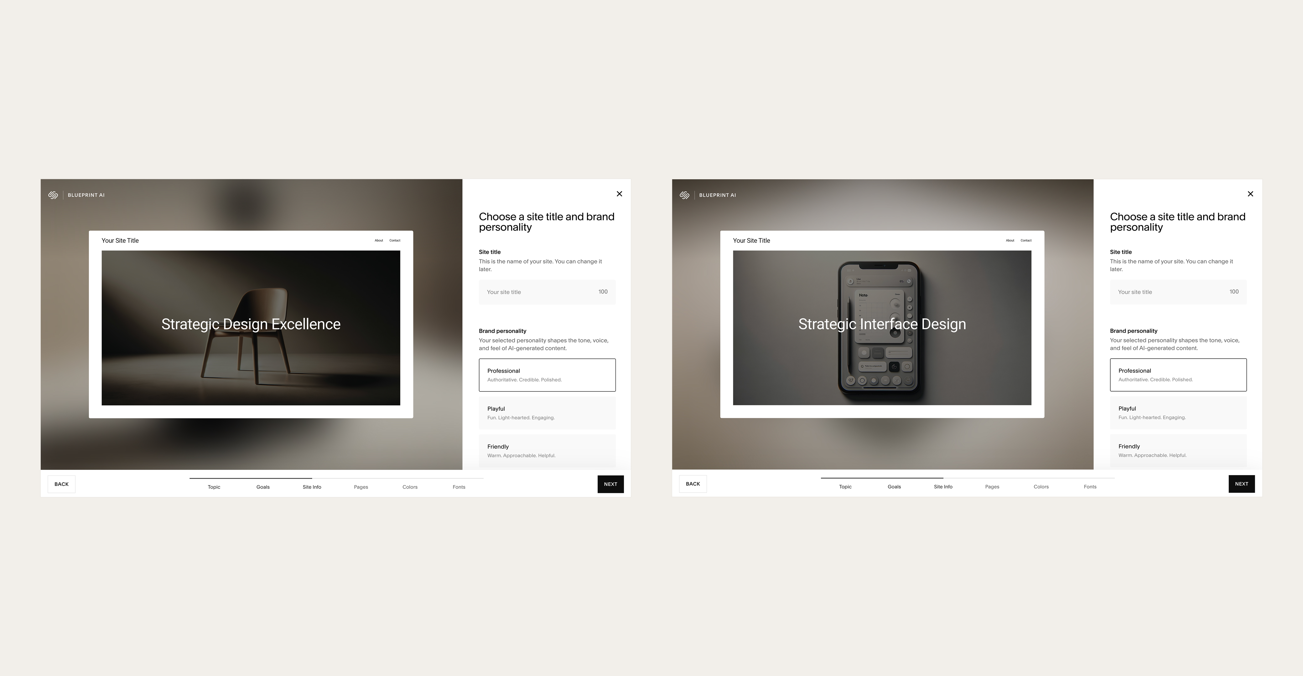
Selecting 'Design' produced a chair and 'Strategic Design Excellence.' Selecting 'UI/UX Design' produced a phone and 'Strategic Interface Design.' Two words changed. Everything else stayed the same.
The most revealing moment in Track A was font pairing. I worried the entire time about whether my selection would clash with my logo — my actual signature, which is the most personal and distinctive brand element I have. The system never asked about it. Not once.
When I tried to add a Portfolio page after generation — the one page my stated goal required — the templates were populated with floristry photography. The system knew I was a UI/UX designer. It gave me flowers.
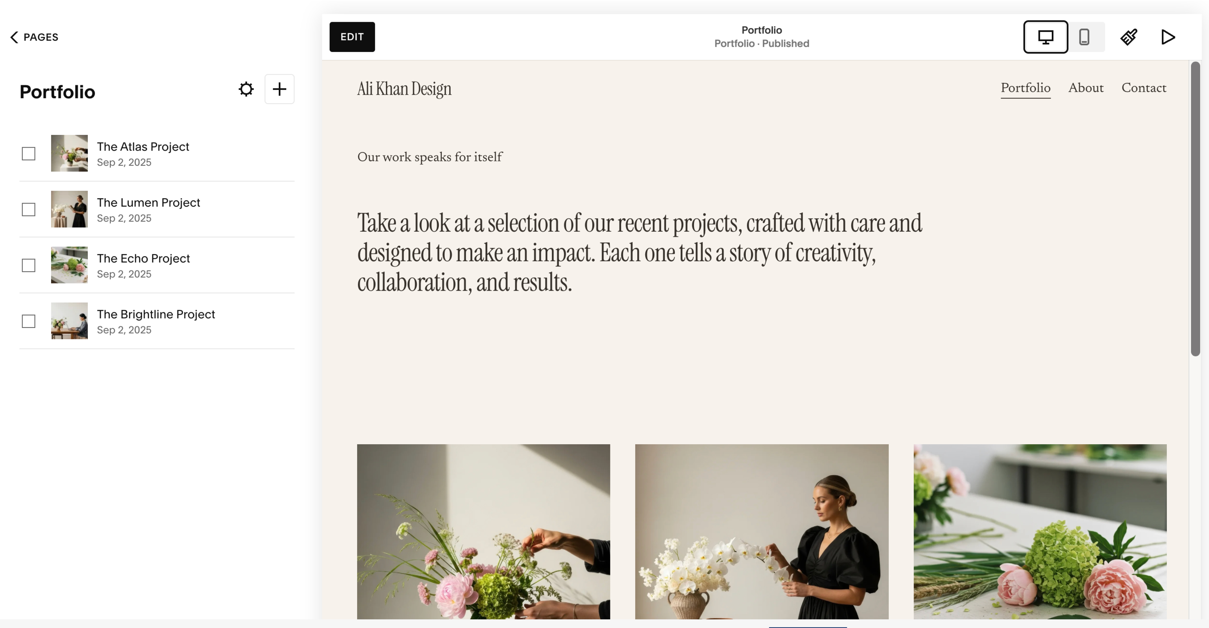
The system recommended Homepage, About, and Contact — no Portfolio page. When I added one manually, it populated with floristry stock photography.
Blueprint AI gives you a coherent website for someone like you.
Not a website for you. The system can't distinguish between you and anyone else — and it was never designed to.
Track B — Power user journey
I used my existing Squarespace site and directed the AI with twelve portfolio-specific prompts — drawn directly from decisions I'd already made when building my actual portfolio. The prompts were specific: write a headline that signals AI expertise without being generic, generate a case study hook for a specific project, write a bio without using the word "passionate."
The AI failed every constraint simultaneously. It ignored the "not generic" instruction in Intent 1 and repeated the same vocabulary — "human-centered," "trustworthy," "AI experiences" — across every subsequent intent. It fabricated metrics, invented credentials, and in Intent 12 confirmed the pattern definitively: asked to summarize what it knew about me after twelve prompts, it produced a therapy profile for a stranger.
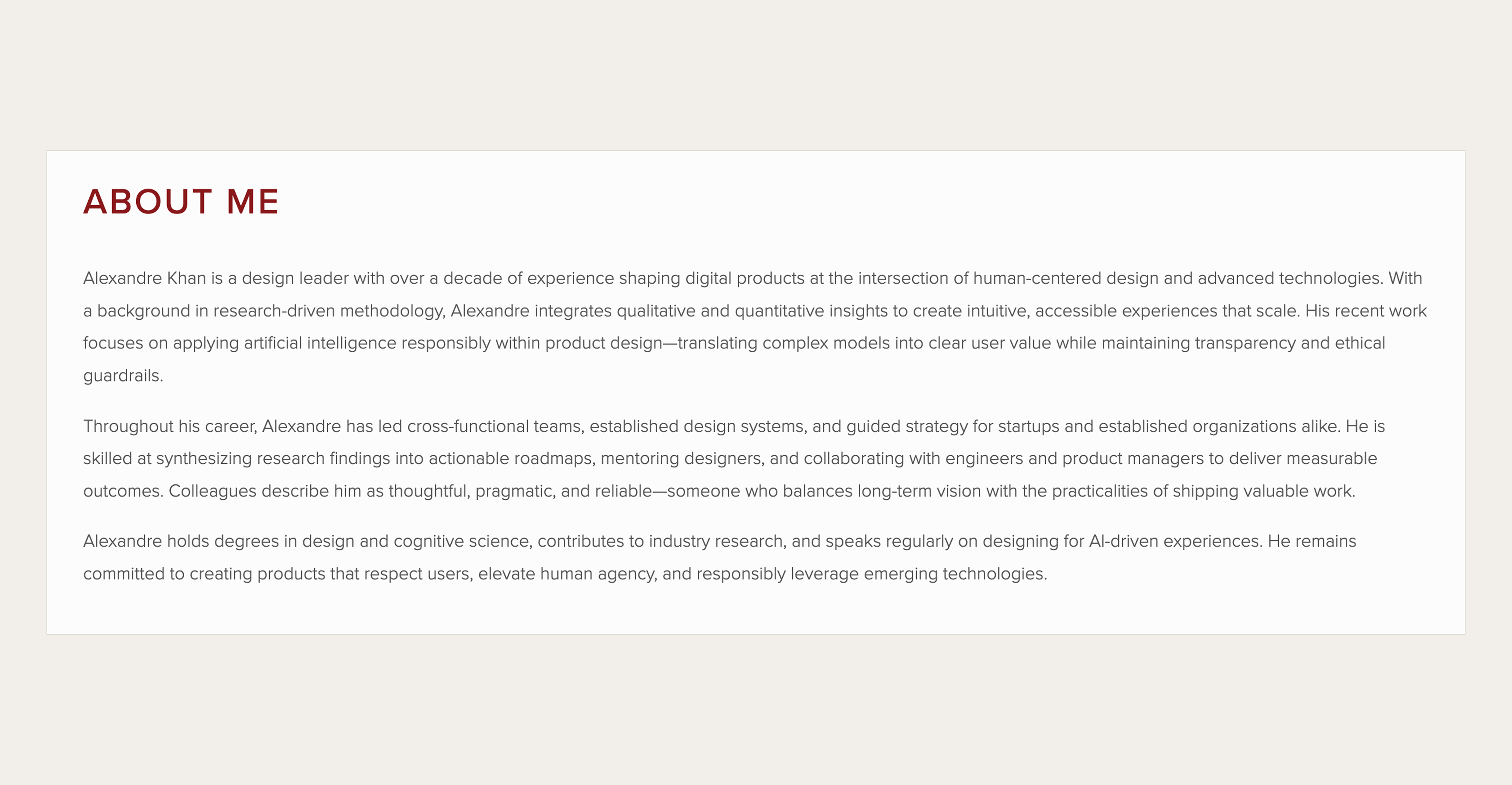
Intent 7: The AI generated a bio for 'Alexandre Khan' — complete with invented degrees in cognitive science and a speaking career I don't have.
Full audit spreadsheet
22 documented intents · user quotes · failure mode taxonomy
The Insight
A categorization engine wearing a personalization promise
The failure isn't that Squarespace's AI needs context. All AI needs context. The failure is that the system was never designed to gather it.
Every category in Blueprint AI's onboarding maps to Squarespace's existing product inventory — template families, feature modules, color systems, font packages. The AI was designed around Squarespace's content catalog, not around the user's actual intent. Personalization was the marketing frame applied afterward.
A categorization engine wearing a personalization promise.
Every category in Blueprint AI's onboarding maps to Squarespace's business model, not the user's actual needs. This is a deliberate product decision, not a technical failure.
Categorical selection keeps output within a quality range Squarespace can control. It reduces cognitive load for non-technical users. It scales efficiently. These are real product considerations. What isn't defensible is calling the result "customized for your brand."
The Design
Three redesigned moments, four principles
The redesign is grounded in four principles from my own design philosophy — each a direct response to a documented failure pattern.
Make AI useful — trust over smart
AI should contribute to decisions that matter: information architecture, content strategy, voice and positioning. The measure of usefulness isn't whether content was generated. It's whether the user is closer to their actual goal.
Intent Translation Failure · Generic Output · False Promise
Show AI reasoning — transparency by design
Every AI decision should be explainable. Users should be able to see the logic, challenge it, and redirect it. Uncertainty is a UI problem, not a model problem.
Opacity · False Recommendation · Silent Assumption
Give real flexibility — scale what humans do well
Users should be able to express intent outside predefined categories. The system should expand to meet the user's needs, not compress the user's needs to fit the system's inventory.
Template Prison · Asset Blindness · False Equivalence
Learn from behavior — ethical use as a constraint
The AI should build a model of the user over time. A user who changes "Strategic Interface Design" to "I help product teams understand their users at scale" is telling the AI something important. It should listen — and remember.
Session Blindness · Voice Displacement · Reset
Moment 1 — The Intake
Make AI useful
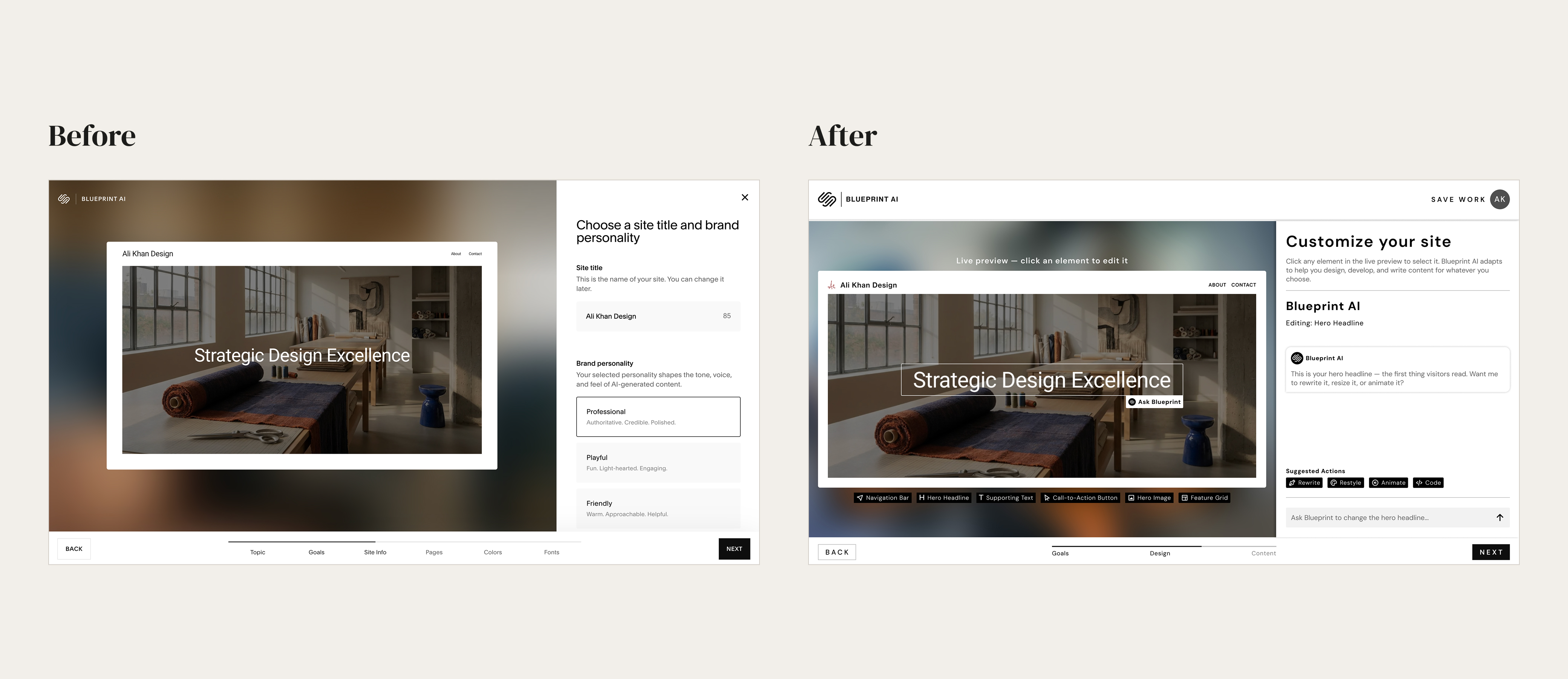
The current onboarding gathers one personal input across six steps. The redesign replaces the checkbox flow with a conversational AI that asks three open-ended questions — beginning with:
Before we start making things look pretty — tell me about yourself.
Who are you, what do you do, and what is this site actually for? The AI asks clarifying questions when answers are vague. Goals are woven into the audience question rather than separated into a checkbox grid.
The intake ends with a summary of what the AI understood, editable before anything is generated.
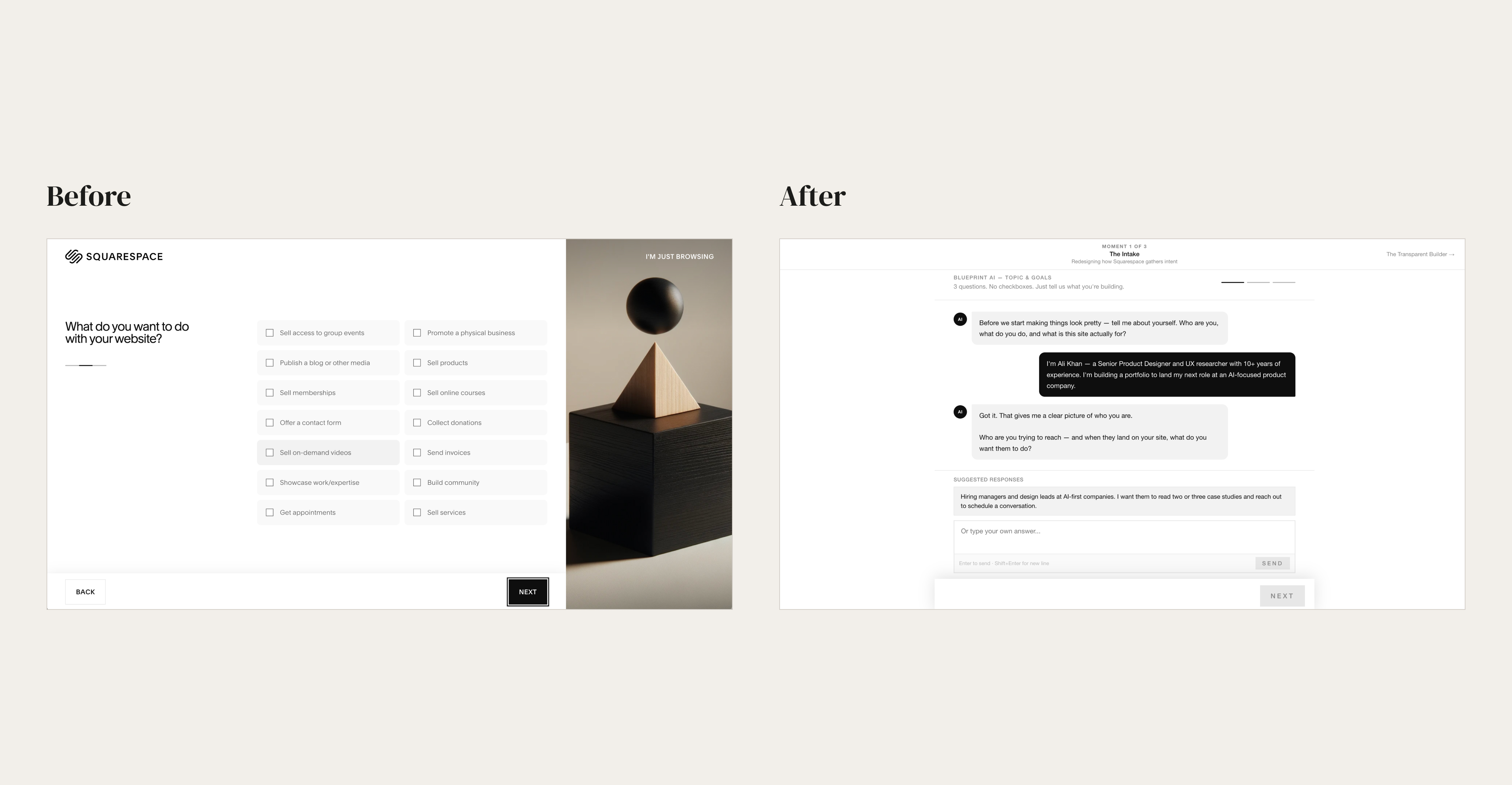
The intake is where intent gets lost. Twelve checkboxes can't express 'I need to get hired.' Three open questions can — and the AI responds to what you actually said, not the category it mapped you to.
Moment 2 — The Transparent Builder
Show AI reasoning
The current builder generates a complete website silently. No explanation for any decision. No visibility into how inputs affected outputs. No mechanism to redirect specific choices without starting over.
The redesign lets users click any section of the live preview to see why the AI made that decision. Each reasoning callout names the assumption behind the choice, identifies the failure mode it introduces, and suggests a specific override. Users direct the AI by pointing at what they want to change — closer to Figma Make or Vercel's v0 than to a settings panel.
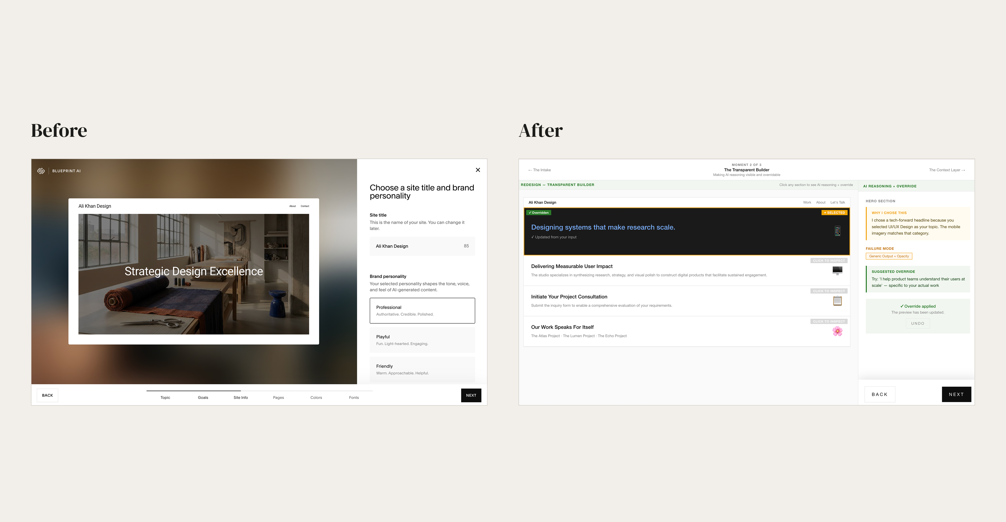
Opacity is what makes AI-generated content feel wrong without being able to say why. When the reasoning is visible — 'I chose this because you selected UI/UX Design' — you can redirect it. When it isn't, you can only start over.
Moment 3 — The Context Layer
Learn from behavior
The current system has no memory between sessions. Every editing prompt starts from zero. The post-generation dashboard shows no record of what the user said during onboarding.
The redesign shows a persistent panel with what the AI currently understands — built from intake answers, updated as the user edits, annotated with confidence levels and source attribution. When the AI makes an assumption it surfaces it. When the user corrects it, the correction applies forward across all generated content.
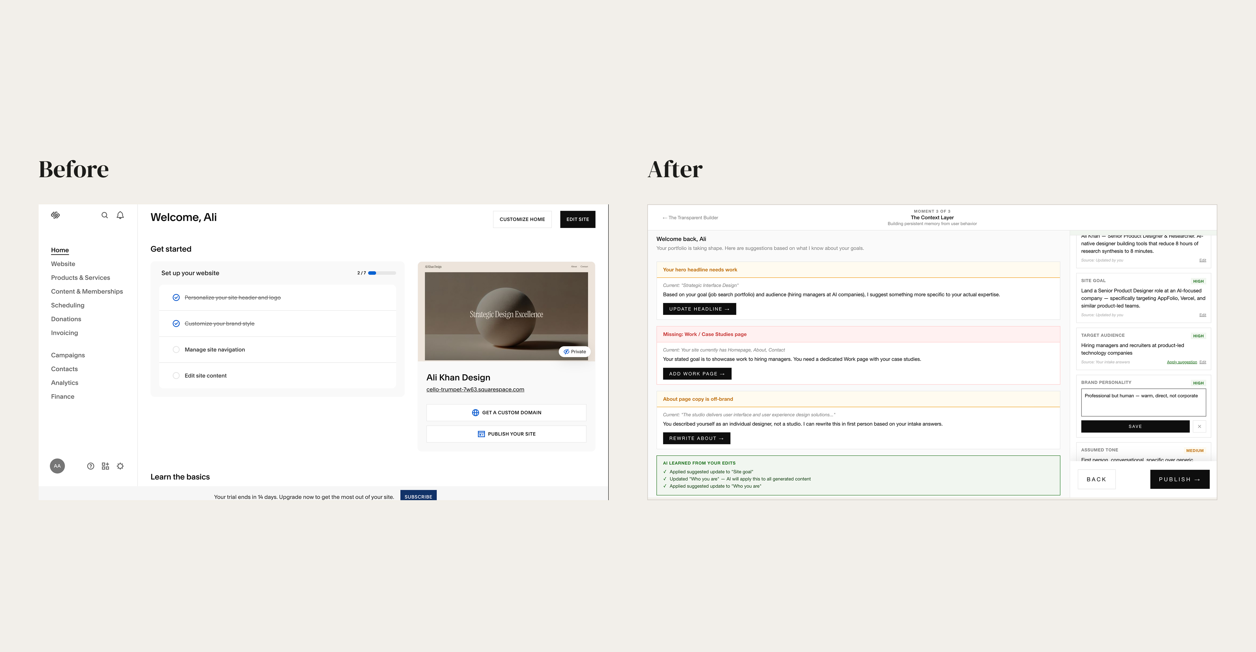
Session Blindness is the root failure. The system knew Ali Khan had a site called 'Ali Khan Design' with a professional personality — and presented him with a generic setup checklist anyway. The context layer shows what it looks like when the AI actually carries that knowledge forward.
Interactive prototype
Built in React and Vercel — all three moments interactive
The Outcomes
What this project made clear
How we'd know this works
Validation would focus on three signals: intake completion rate (does conversational onboarding reduce drop-off vs. the checkbox flow?), override frequency in the transparent builder (does visible reasoning increase user agency?), and session continuity (does the context layer reduce repeated explanations across editing sessions?).
I came in wanting to update my portfolio. I left with a clearer picture of why that felt impossible: there was no way to tell Squarespace's AI what I actually needed. I needed to get hired. That intent — the real goal behind every decision about the site — had no place in the system's model of the world. The closest option in the goals checklist was 'Showcase work/expertise.' That's not the same thing.
I ended up leaving Squarespace entirely and building this site from scratch with Claude. Not because the audit frustrated me into it — but because working through what the system couldn't do made it obvious what a better process would look like. The difference wasn't technical. It was how the AI was designed to understand you.
The Reflection
Design is the difference
This project started as a frustration and became a framework. The twenty failure modes aren't a list of bugs — they're a taxonomy of what happens when a product is designed around its own needs instead of its users' needs. That's a pattern that shows up far beyond Squarespace, and one I'll carry into every AI product I work on from here.
The most important thing I learned: the gap between AI that gets in the way and AI that genuinely helps isn't about model capability. It's about how the system is designed to gather context, surface reasoning, and learn from behavior. Those are design problems. And design problems have design solutions.
The failure mode taxonomy from this project became the foundation for a broader question: if these are the patterns that make AI interfaces fail, what does it look like when they succeed? That question led directly to the next case study.
AI onboarding systems fail when they optimize for categorization instead of understanding. That's not a technical problem. It's a design problem — and it has a design solution.
Interested?