People-First Enrollment Redesign
People-First Enrollment Redesign
WTW · Via Benefits · Q2 2023
What happens when a product is designed around how the business works instead of how people think? For Medicare and Individual and Family Plan enrollees navigating health insurance, the answer was abandonment, frustration, and a flood of support calls that didn't need to happen.
45%
Faster time-to-convert
15%
Lift in total enrollments
50%
Reduction in rage clicks
33%
Increase in task completion
My Role
UX Designer & Researcher, Product Strategist
Methods
Behavioral Analytics, Unmoderated and Moderated Testing, SUS Benchmarking, User Interviews
Tools
FullStory, UserLytics, Figma
Status
Shipped redesigned user flow
The Context
Designing for people who can't reliably name the coverage they already have
Via Benefits is Willis Towers Watson's individual benefits marketplace, used by Medicare-eligible retirees and pre-Medicare individuals to shop for health insurance coverage. The platform handles hundreds of thousands of enrollments annually, which makes every friction point in the funnel a business problem as well as a user one.
The domain is unusually unforgiving. Medicare, Medicare Advantage, and Medicare supplement are three different things with overlapping names, and the distinctions carry real financial consequences. This isn't a matter of shoppers being uninformed. When researchers preparing a Commonwealth Fund survey sat down with people already enrolled in Medicare and checked their answers against their own insurance cards, they found people confusing traditional Medicare with Medicare Advantage, and Medicare Advantage with Medigap. Even people currently enrolled couldn't reliably say which kind of coverage they had.
Layer onto that an audience in their sixties and beyond, many of them navigating this for the first time, under an annual deadline, on a decision they can't easily reverse for a year.
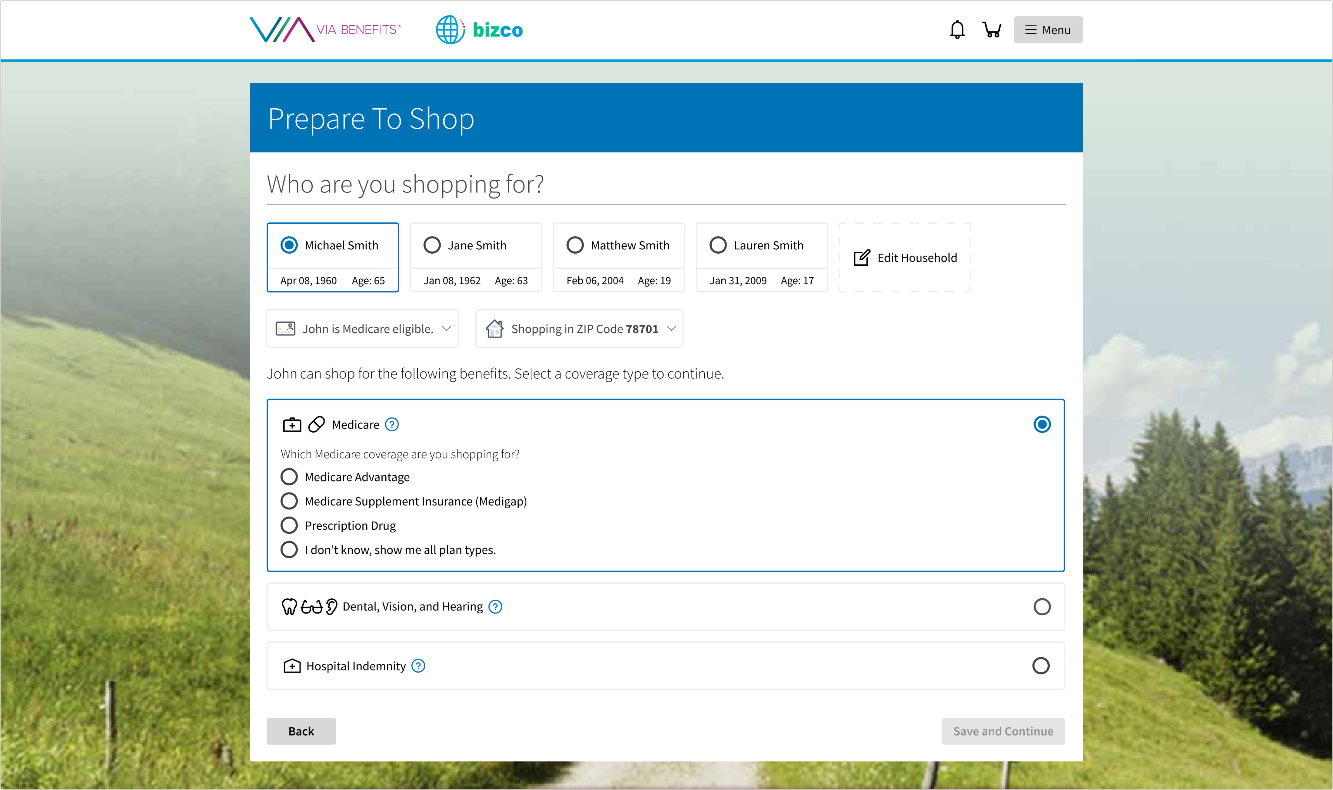
I joined as the sole UX designer on the shopping experience team, and I want to be honest about the starting point: I didn't understand this domain either. Learning which products a given person is eligible for, and why, took me months of reading eligibility rules and asking questions. That turned out to be the most useful thing I learned on this project, because it meant I stopped assuming the existing structure made sense to anyone and started asking whether it made sense at all.
The Problem
A mandate to improve shopping, and no agreed problem to solve
My mandate was broad: improve the enrollment experience. What existed was a stale backlog that hadn't been meaningfully prioritized in a long time, and no shared view of where the shopping flow was actually failing. Different people had different theories, none of them evidenced.
That absence was the real starting problem. Before I could improve anything, I had to find out what was broken, and the team had no reliable way to answer that question.
Interested?