Honest Design System
Honest Design System
Ali Khan Design · Self-Initiated · Q4 2025–Ongoing
Most portfolio sites are built on templates. This one is built on a design system — 39 components, a two-layer token architecture, and a Figma library that matches production code 1:1.
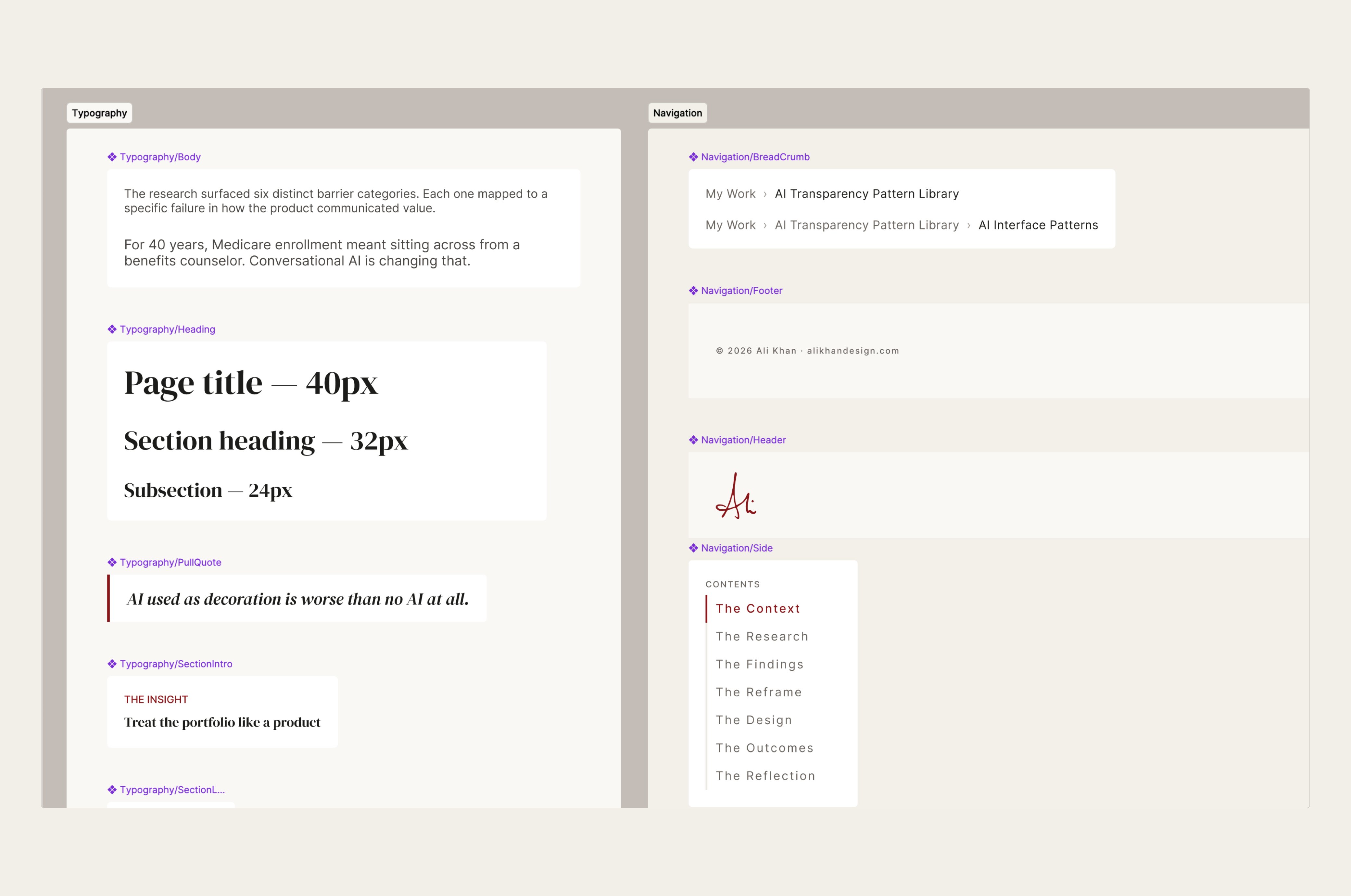
39
Components
WCAG 2.1 AA
Accessibility standard
100
Lighthouse score
1:1
Figma-to-code parity
My Role
Design Systems Designer & Engineer
Methods
Design systems architecture & governance
Tools
Next.js, React, TypeScript, CSS custom properties, Storybook, Figma
Status
Deployed to production
The Context
A portfolio that needed to mean something
When I decided to rebuild my portfolio from scratch, the question was never what to show. The question was whether the portfolio itself would hold up as a piece of craft. Most designer portfolios are built on templates — fine for shipping quickly, not so useful when the portfolio is supposed to demonstrate exactly what you can do.
I wanted the site to feel like me: warm but not precious, structured but not rigid, and honest about what it is. A template couldn't get there. A design system built specifically for this context could.
The Decision
Why build a system instead of a site
Building a design system for a portfolio is, on its face, overkill. But the alternative — designing components ad hoc and hoping they cohere — produces exactly the kind of inconsistency I spend my professional life trying to fix for other teams.
More practically: I wanted the site's code and Figma documentation to match 1:1. That only works if the design decisions are made deliberately, captured as tokens, and implemented consistently. That's a design system, whether you call it one or not.
The name Honest came from my design philosophy: I build trust through evidence, not aesthetics. The system should be exactly what it claims to be. No decorative tokens. No components that exist for appearance only. Everything earns its place.
“The constraint that sharpened every decision: if a component doesn't have a live instance on this site, it doesn't exist in the system.”
Token Architecture
Two layers: primitives and semantics
The token architecture has two layers. Primitive tokens define the raw values: hex colors, rem sizes, numeric weights. Semantic tokens map those primitives to intent: --text-muted is a semantic token that resolves to #6B6560. Components always reference semantic tokens, never raw values.
This separation means that if the palette changes, the swap happens in one place. It also makes Figma documentation straightforward: every token in the Figma library maps directly to a CSS custom property, by name.
/* Primitives */
--red-800: #89181A;
--warm-50: #FAF8F5;

/* Semantics */
--color-accent:  var(--red-800);
--color-bg:      var(--warm-50);
All spacing, typography, color, motion, and radius values are tokenized. There are no magic numbers in component code.
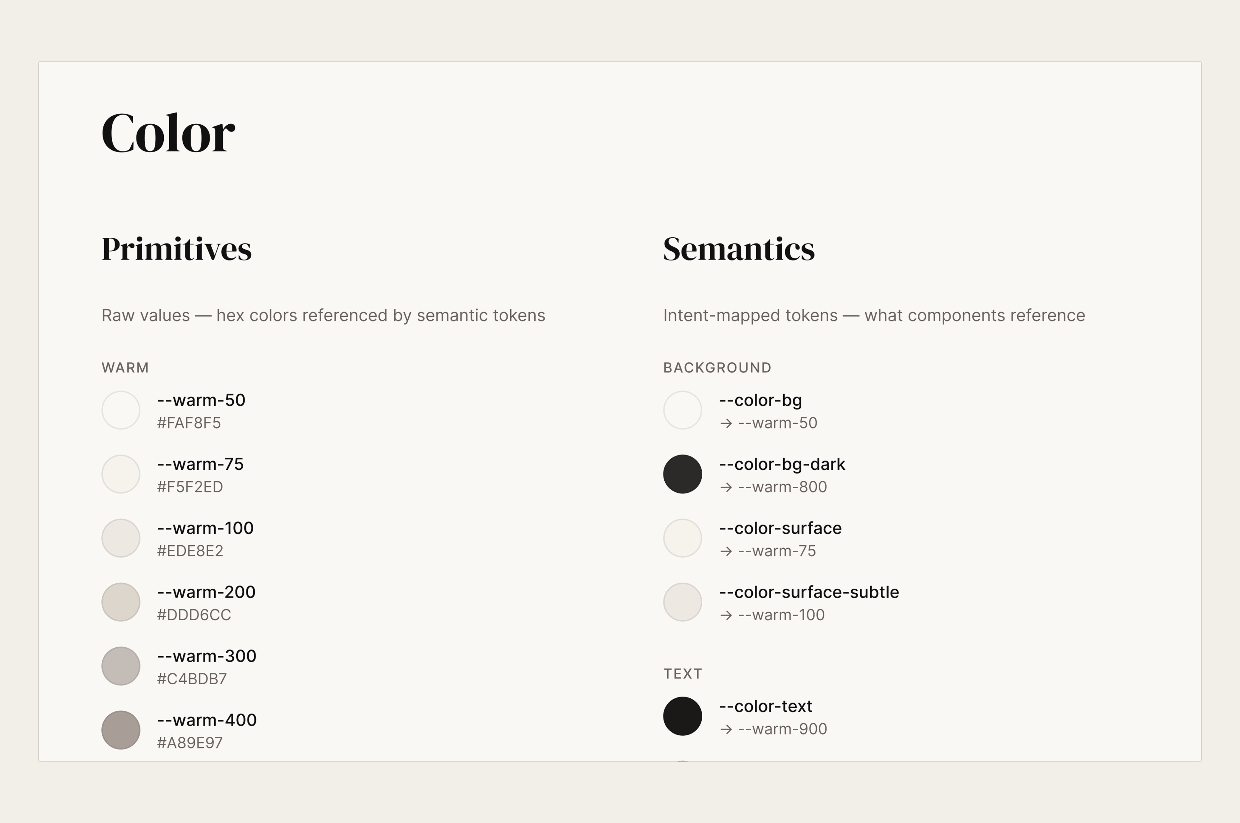
Primitive tokens (left) and semantic tokens (right) in the Figma library. Every CSS custom property has a matching Figma variable by name.
Type and Spacing
Rem-based, predictable, and purposeful
The type scale is rem-based with a 16px root. Every size from --text-xs (12px) to --text-5xl (48px) is a named token. This makes the type scale accessible — it inherits user browser preferences rather than overriding them — and consistent across every component.
Two typefaces: DM Serif Display for headings, Inter for UI text. The pairing was chosen for contrast and warmth. Serif headings carry weight without formality. Inter handles small sizes and data cleanly without drawing attention to itself.
Letter spacing is one of the details that most design systems underspecify. Honest has three explicit values: sm (0.02em, nav links), md (0.08em, tags and callout titles), and lg (0.12em, eyebrows and section labels). Each scale value is tied to a specific use case, not used interchangeably.
--letter-spacing-sm
Sample
0.02em · Nav links
--letter-spacing-md
Sample
0.08em · Tags, callout titles
--letter-spacing-lg
Sample
0.12em · Eyebrows, section labels
Component Decisions
39 components, each with a reason to exist
The component inventory came from the site itself, not from a wishlist. Every component in the system has a live instance somewhere on the site. If a component was proposed during build and couldn't be placed, it was cut.
The system started with a core set of layout and content components and grew as the site's needs grew. When the AI Interface Pattern Library needed demos, pattern-specific components were added. When the portfolio chatbot was built, Chat UI components followed. Each addition came with a live consumer — the rule held throughout.
Two components are worth calling out because the decisions behind them reflect the system's philosophy:
ContactModal
The contact flow uses a modal with form fields rather than a mailto link. Mailto opens a local email client — a reasonable assumption in 2012, not in 2026, when a growing percentage of people have no default mail client configured. A modal keeps the interaction in-context, works on every device, and gives me control over the experience. The tradeoff is complexity; the reason to accept that tradeoff is user reliability.
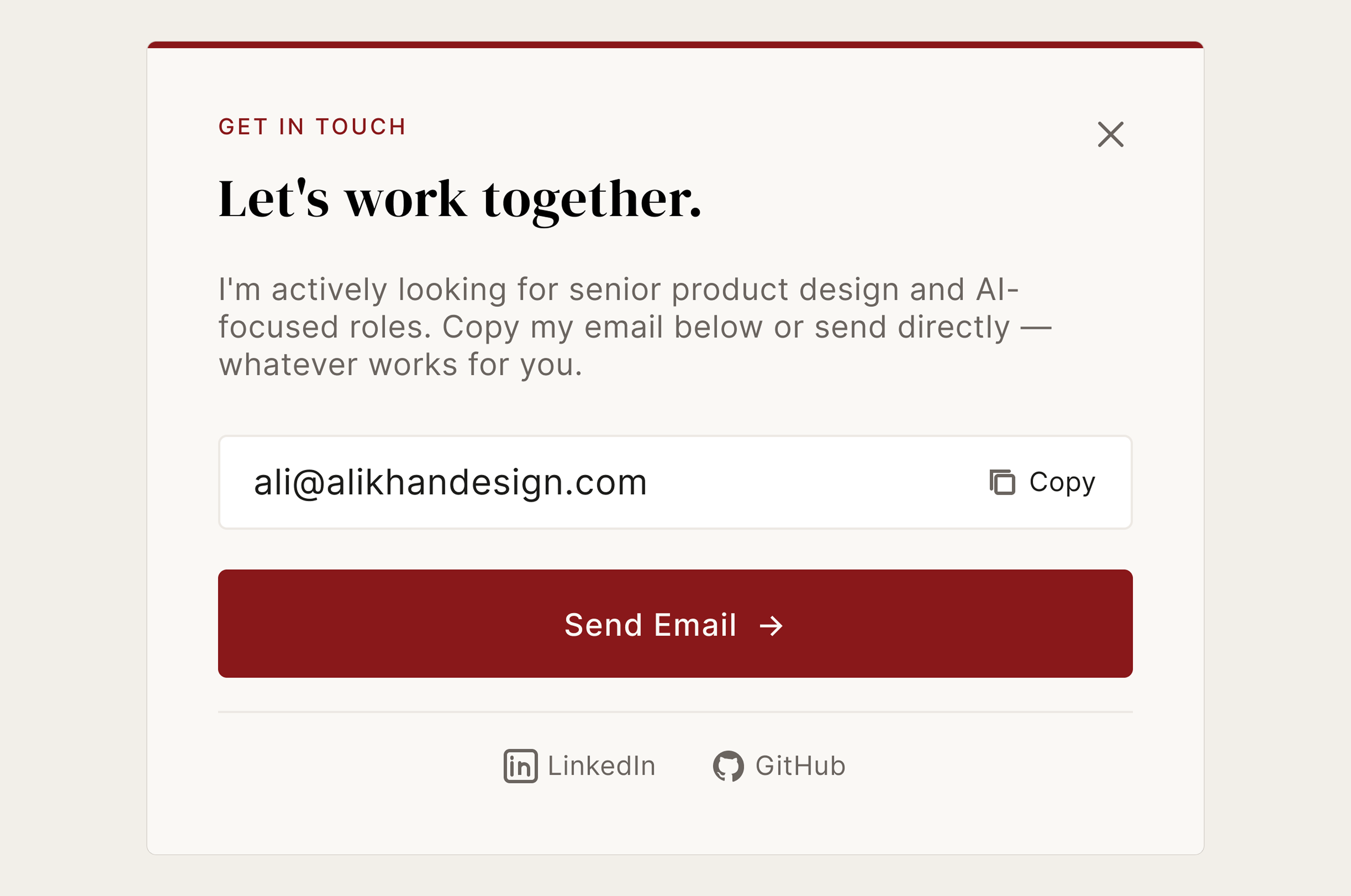
ContactModal in its open state. Form fields and direct contact options replace a mailto link so the interaction stays in-context on every device.
PasswordGate
Several case studies contain work done under NDA or for clients whose data is sensitive. Rather than omit this work entirely or publish it without protection, PasswordGate provides controlled access. The pattern is intentionally low-friction for people with the password and appropriately blocked for those without one. It's a designed decision about information architecture, not just a lock on a door.
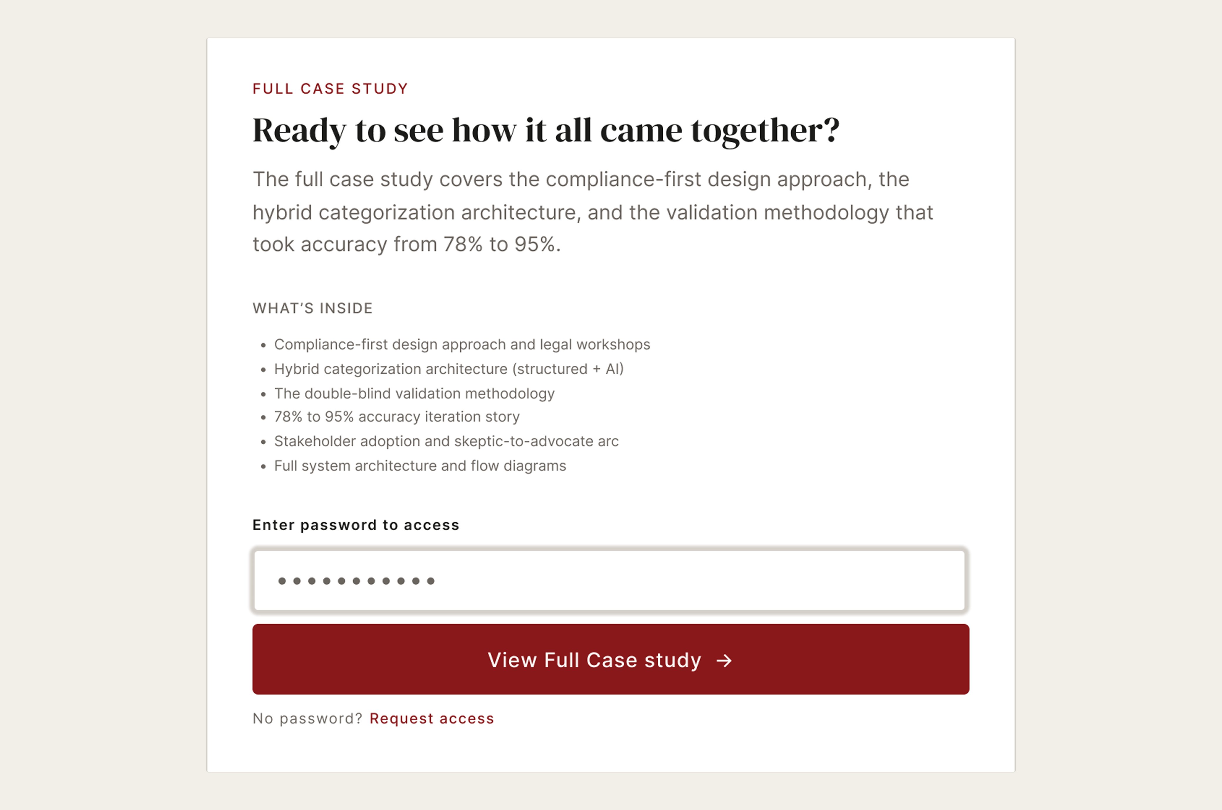
PasswordGate in Figma. The component exposes a title, description, bullet list of contents, and password field — all configurable per case study.
Accessibility
WCAG 2.1 AA across every component
Accessibility was a first-class requirement, not a post-build audit. All 35 WCAG 2.1 Level AA criteria pass. Lighthouse scores 100 on both desktop and mobile across all pages. Zero axe-reported errors. A full VoiceOver and keyboard audit was completed and documented.
One known gap: SideNavigation does not currently implement an aria-live region for active section announcements to screen reader users. This is documented, de-prioritized (the component is decorative navigation, not primary wayfinding), and on the backlog.
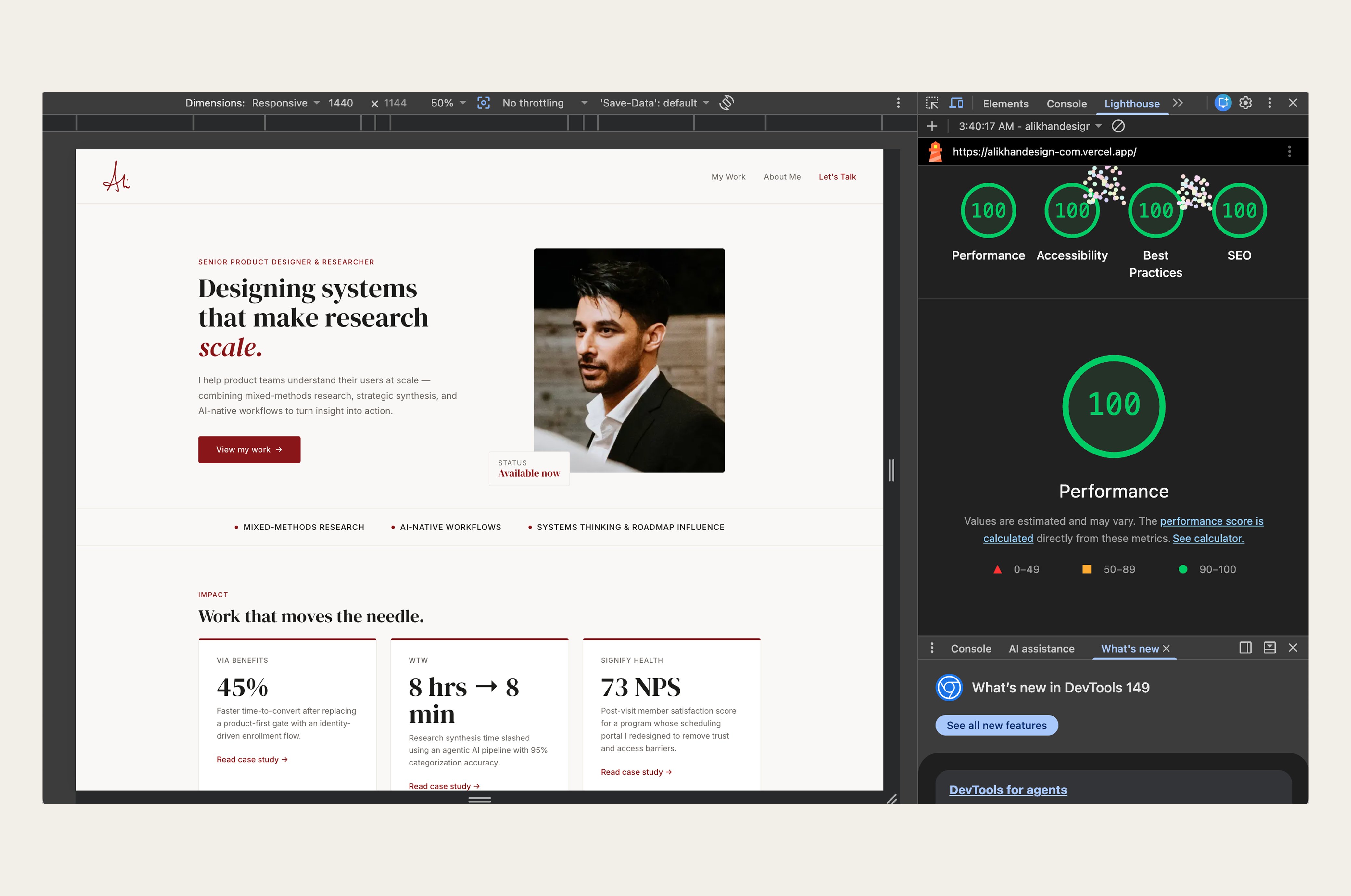
Lighthouse 100 across all four categories. Scores are consistent across desktop and mobile on every page.
Storybook
Documentation as a live artifact
Every component in the system has a corresponding Storybook story. Stories document the component's props, variants, states, and intended use cases. The Storybook instance is deployed publicly at honest-design-system.vercel.app.
The Storybook serves a specific purpose for this project: it lets a hiring manager or collaborator inspect the system in isolation, separate from the portfolio site. You can see how each component behaves across its states without navigating the site to find an instance. That's the difference between documentation and evidence.
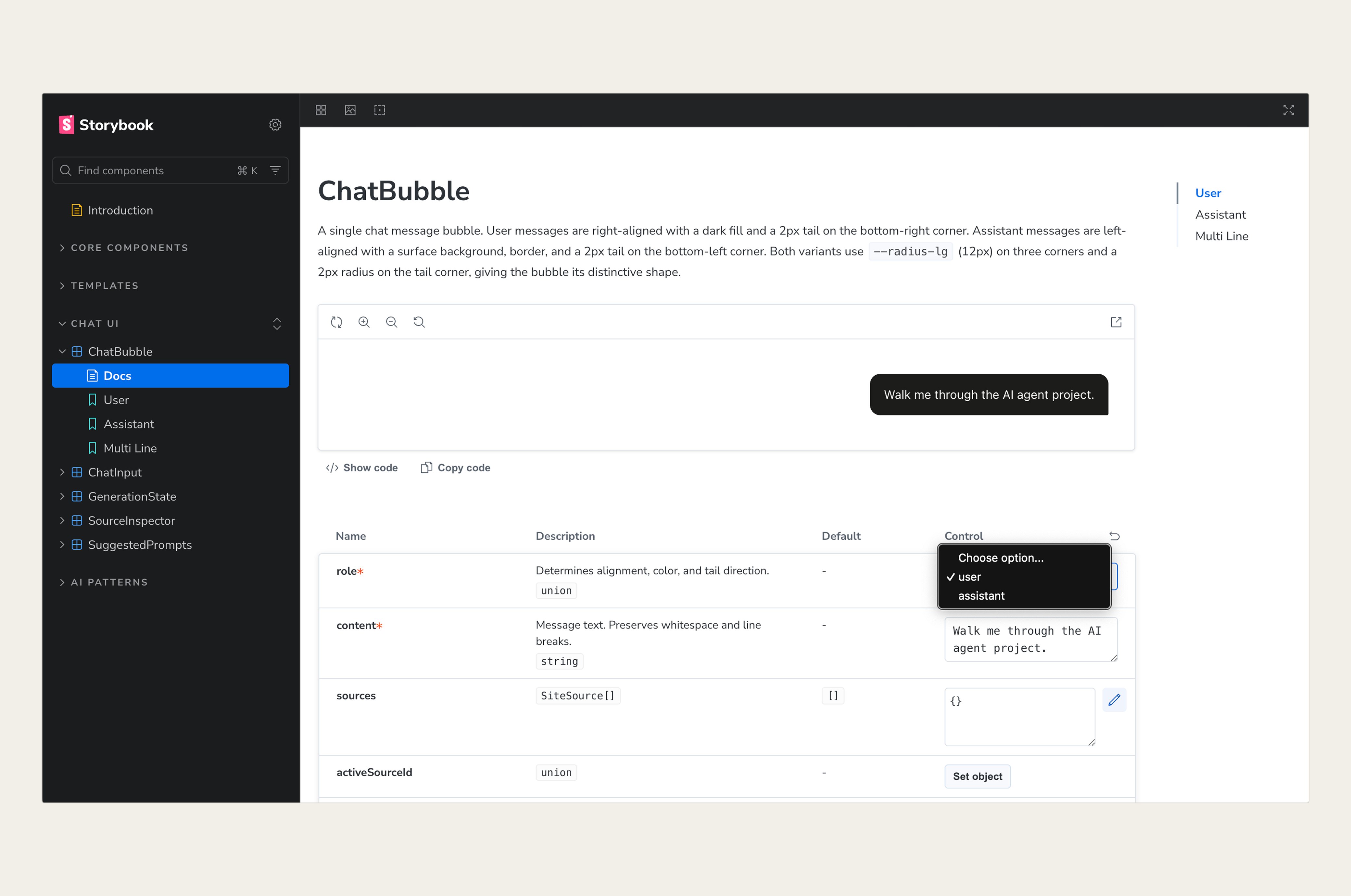
The Storybook instance at honest-design-system.vercel.app. Every component has a story; every story has documented controls.
Figma Parity
Design leads code, not the other way around
The Figma component library matches the production codebase 1:1. Token names, component names, prop names, and variant names are identical across both environments. This isn't just for neatness — it removes ambiguity in handoff and makes the Figma library useful as a reference for development, not just a source of screenshots.
One deliberate constraint: Figma design decisions lead code changes, not the reverse. When design specs change, code is updated to match. This preserves Figma as the source of truth and prevents the library from drifting from what's actually on the screen.
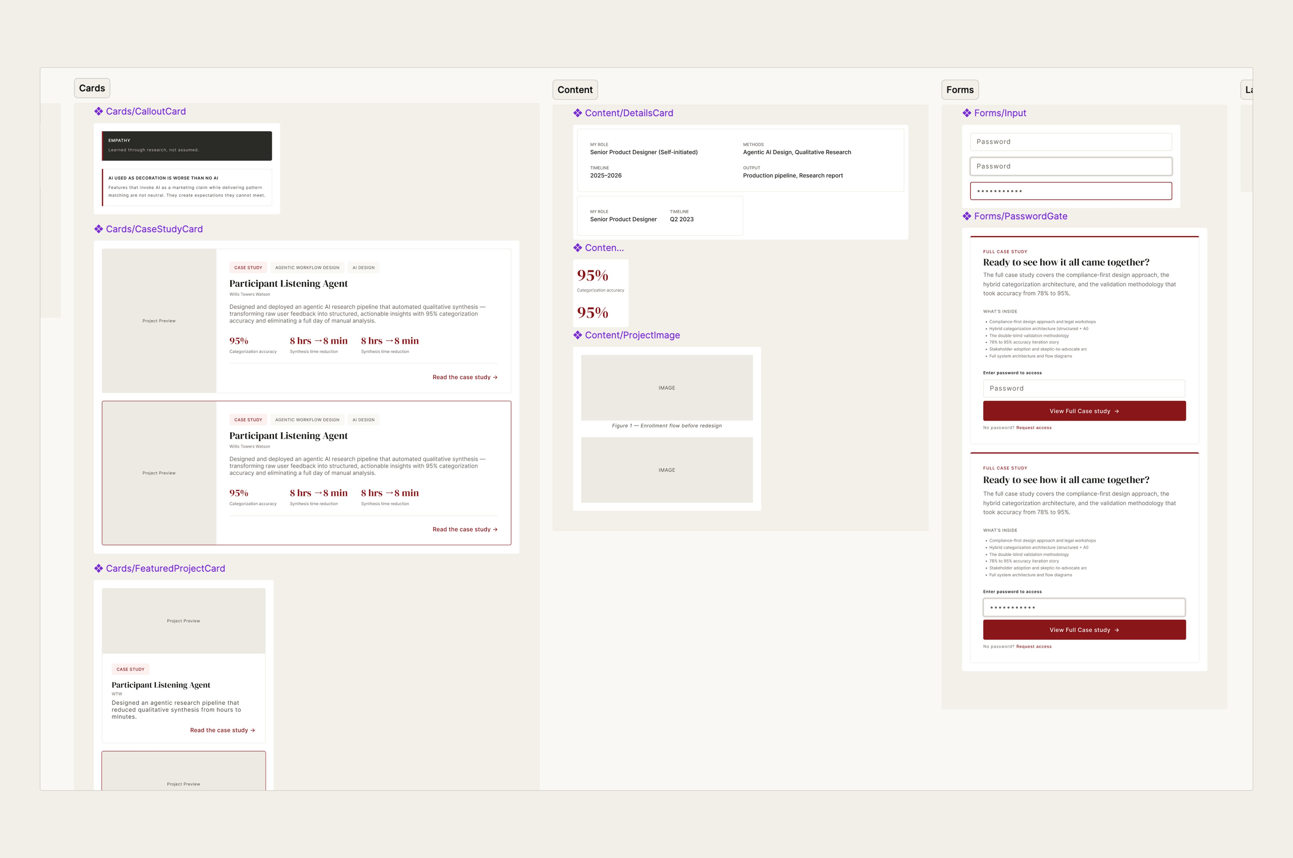
The Figma component library. Component names, variant names, and token references match production code exactly.
The Reflection
What a design system built for one teaches you
Building a design system at enterprise scale means negotiating with constraints you didn't set — existing codebases, engineering capacity, legacy decisions, competing roadmap priorities. Building one for a single site means every constraint is your own. That's clarifying.
The decisions I made under pressure in larger systems — skipping token naming conventions, treating accessibility as a phase rather than a property, letting Figma and code drift — I avoided here because there was no one to negotiate with. It's easier to hold the line when you're the only person in the room.
The takeaway I'd bring back to a team: most design system debt isn't from bad decisions. It's from deferred decisions. The token architecture, the accessibility baseline, the Figma-to-code parity — none of it is hard to establish on day one. It's very hard to retrofit on day three hundred.
Interested?