
Ventric Health Vivio App Design System
The Brief: Ventric Health’s Vivio is a revolutionary diagnostic tool designed to detect early signs of congestive heart failure. However, the initial version (v1) was developed primarily by engineering teams with a focus on technical backend functionality rather than the end-user. This resulted in a complex, "dev-centric" interface that prioritized data output over clinical usability, creating significant friction for the healthcare providers tasked with making life-saving decisions.
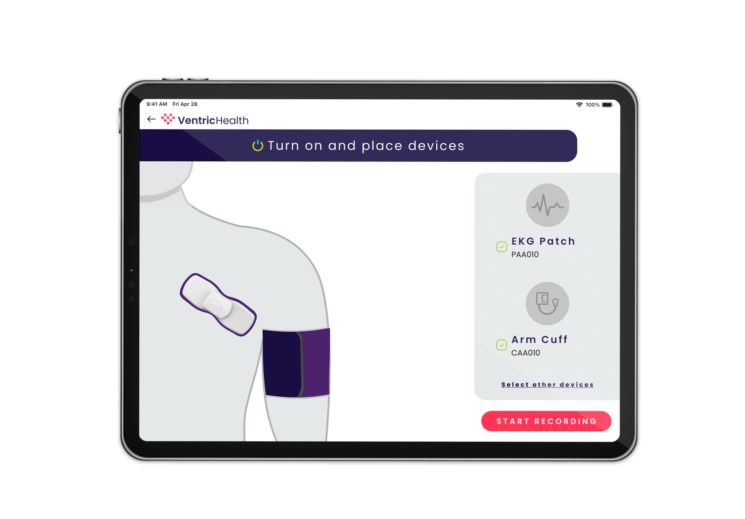
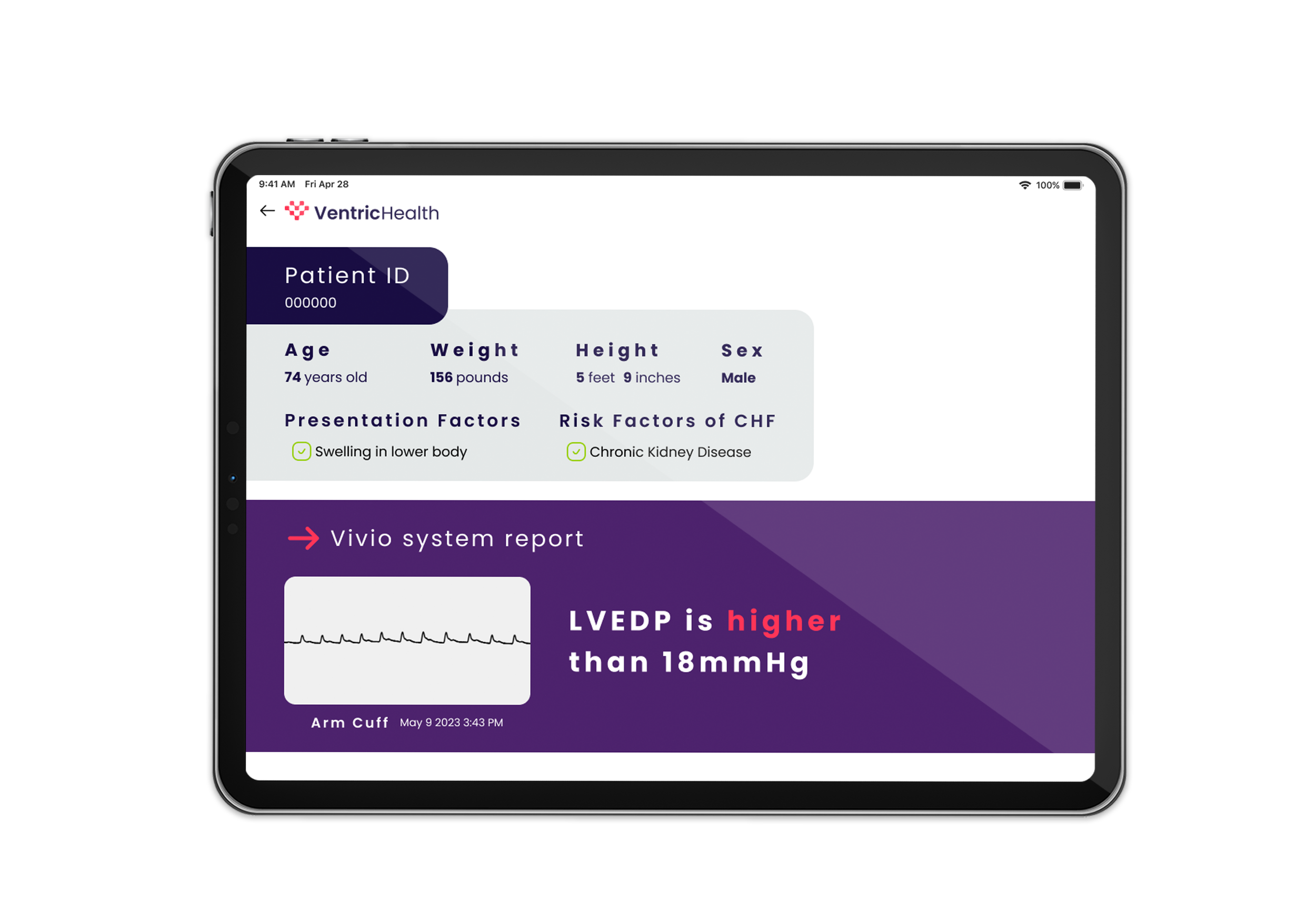
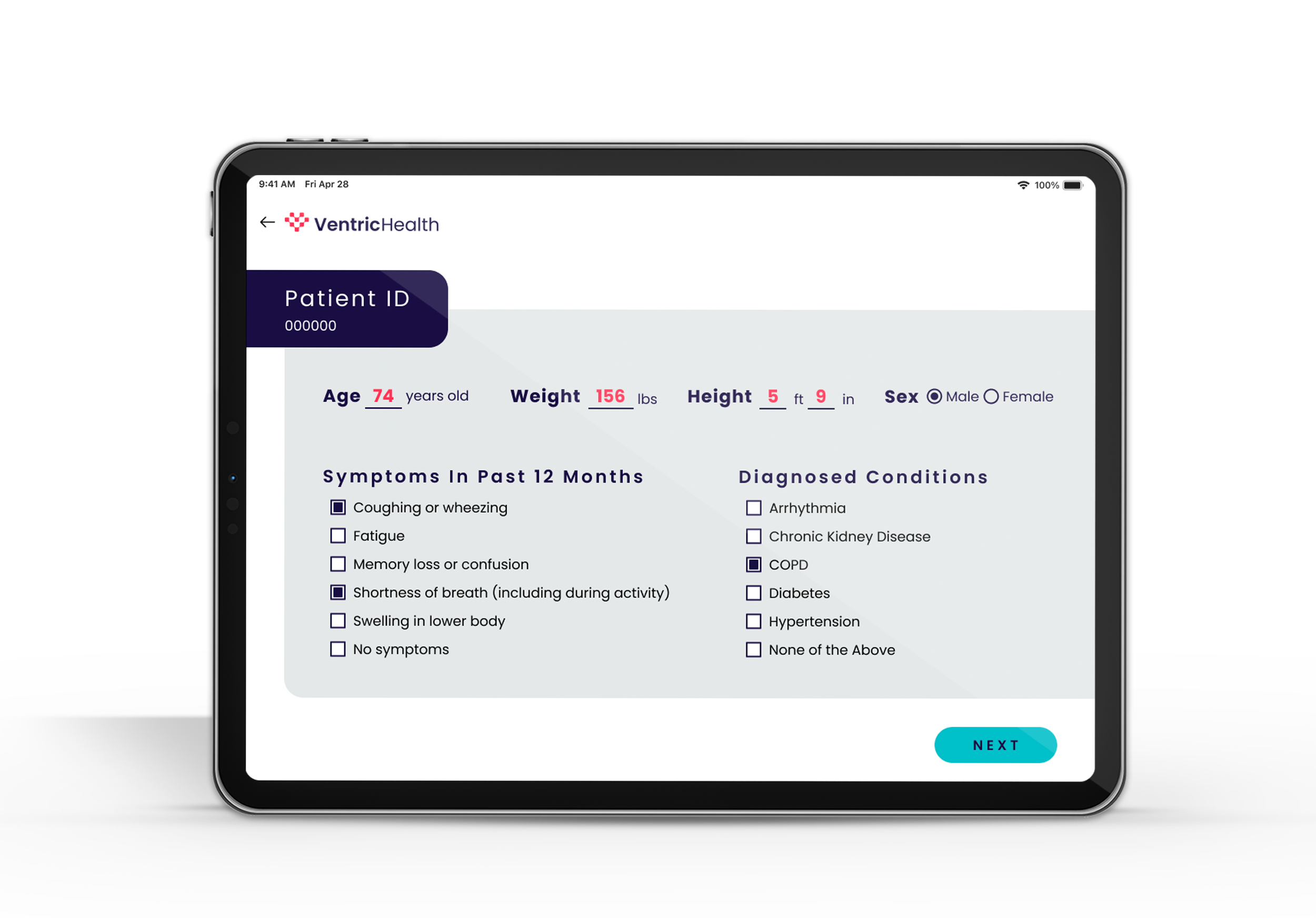
The Problem: Healthcare providers using Vivio faced high cognitive load and fragmented workflows due to the lack of user-centered design. Because the interface lacked visual hierarchy and contextual clarity, providers struggled to access critical information during time-sensitive diagnostic windows. This technical density didn’t just frustrate users—it created a barrier to the rapid, accurate clinical decisions required for early-stage heart failure detection.
The Process: With limited access to proprietary data and a restricted research scope, I pivoted to a SME-led and comparative strategy to bridge the gap:
Competitive Analysis: I audited existing medical interfaces and diagnostic software to identify industry-standard best practices and common UI pitfalls in clinical settings.
SME Collaboration: I worked closely with Subject Matter Experts (SMEs) to map out the provider’s actual workflow, identifying the "precise moments" where specific data points became most critical.
Design System Architecture: To fix the inconsistencies of v1, I built a comprehensive, custom design system from the ground up in Figma. This ensured that every component was reusable, scalable, and optimized for professional healthcare environments.
The Solution: The redesign transformed Vivio from a data-heavy technical tool into a streamlined diagnostic partner. By implementing a unified design system and prioritizing contextual information, the new interface surfaced critical patient data at the exact point of decision-making. The result was a cohesive, professional user experience that reduced repetitive tasks for designers and, more importantly, provided a smoother, faster, and more accessible path for clinicians to diagnose heart failure.